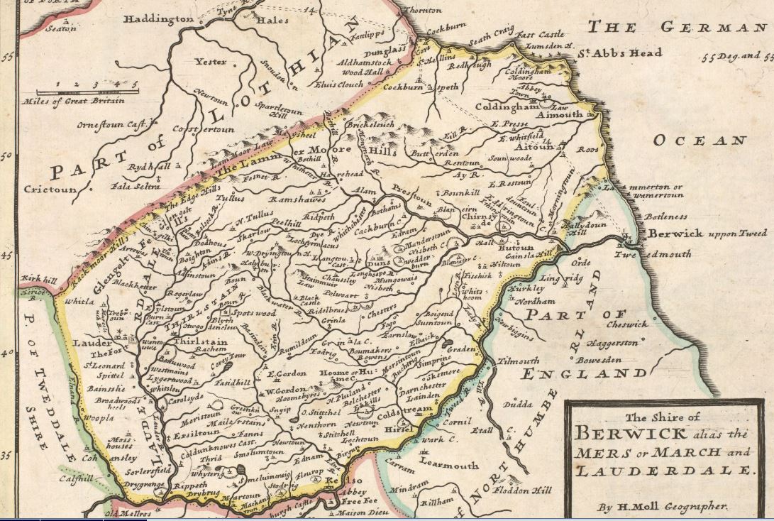
Maps for use in Schools
Maps are an important teaching resource, supporting the study of a wide range of subject areas. On our website, you can investigate a range of curriculum and topic ideas through historic maps, test geographical skills with viewers and tools, and explore many different types of historic mapping.
This resource summarises:
- Tools to view and interpret historic maps
- Topic and Curriculum ideas
- Types of Mapping
- Other resources
Introduction

The National Library of Scotland's collection contains over 1.5 million maps and related items. Although the Library has a particular interest in maps of Scotland, the collection contains detailed maps of the entire United Kingdom, as well as maps and atlases of the rest of the world. The collection is wide ranging, and includes maps created to present information on diverse subject areas, such as railway networks, rainfall patterns or wartime reconnaissance.
The Library has had a deep commitment to map digitisation over the past two decades, and over 400,000 maps are now available to view online.
Our Map Images website offers a range of search options, viewers, and additional tools to facilitate research.
In addition, the Library has created online learning resources relating to maps and cartography, which can be freely accessed via the Library website.
1. Tools to view and interpret historic maps
We have several help guides on using our website including introductory videos. These provide a detailed guide to the different search options, viewers and how to use them.
With our Georeferenced Maps viewer, you can compare maps to each other and to present day map and satellite image layers, view them Side by side, and view them in 3D.
We also have many tools to test geographical skills, including tools for measurement and annotation, for drawing and tracing features, and for tracing an elevation profile.
Georeferenced Maps Viewer
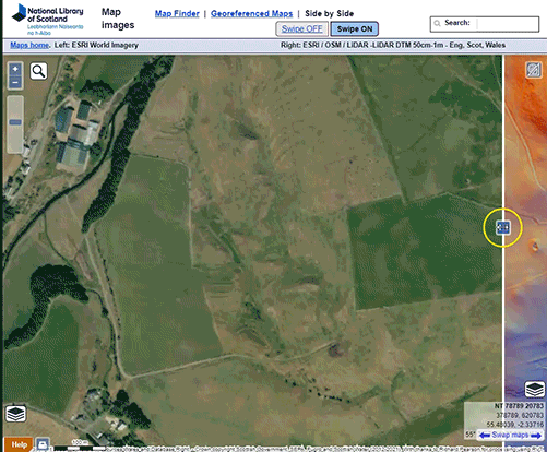
Our Georeferenced Viewer presents a series of maps “seamed” together and aligned with their real world locations. This allows you to explore an entire series as a seamless layer of mapping. As the historic map layers have been aligned with their real-world locations, this allows us to compare the historic maps to modern mapping layers, satellite imagery or LiDAR data with a transparency slider.

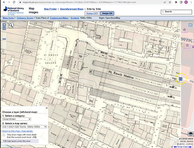
Side by Side Viewer
The Side by Side viewer allows a layer of historic mapping to be viewed in comparison with modern mapping or satellite imagery, or with other historic map layers.

1. Select Side by side viewer
2. Search by a placename
3. Swipe central slider bar
4. Select different layers of mapping from the lower left panel
1. Select Side by side viewer
2. Search by a placename
3. Swipe central slider bar
4. Select different layers of mapping from the lower left panel
Layer suggestions:
- The OS Six Inch, 1888-1913 layer is the most detailed scale covering all parts of Britain and excellent for viewing rural areas a century ago.
- The OS 25 Inch, 1892-1914 layer is the most detailed scale covering most towns and settlements, and excellent for viewing built up areas a century ago.
3D viewer
Our 3D viewer allows you to visualise the landscape from a bird's-eye perspective. You can alter your altitude or distance, your tilt and orientation to explore any of our georeferenced map layers draped over a 3D landscape. You can also fade the transparency and view different base maps, as well as change the vertical exaggeration of the heights/terrain (to make the hills or mountains appear higher).

A bird's-eye perspective like this can be great fun as well as useful. One subject you can study would be the effects of glaciation on the landscape, visualising deeply eroded U-shaped valleys and glacial troughs, corries or cwms with mountain lakes, moraines and screes left by glaciers, and features such as drumlins left by periglacial floodwaters.
Can you find Cwm-y-Llan slate quarry on Snowdon? Use the 'Show Height' function in our Georeferenced Maps viewer to discover what height this quarry was at. How was the slate transported away from the quarry?
Measurement and Annotation

When viewing maps in the Georeferenced Maps viewer, the measurement tools, to the upper right, allow you to measure:
- Bearing or Azimuth - in degrees from true North
- Area - in square kilometres and square miles / square metres and square feet
- Distance - in kilometres and miles / metres and feet
Click or tap on the buttons to toggle the measurement functions on or off. Once selected, click or tap to add points on your route - the current bearing, distance or area is given. Single-click with a mouse or tap to stop and finalise the bearing or distance measurement; double-click with a mouse or double-tap to finalise the area measurement.

Drawing and Tracing Features
With the Georeferenced Maps viewer, or Side by side viewer, you can draw points, lines and shapes for annotating features and your traced features can be printed or saved for further editing. Read further details on drawing features.

- You can Create Features, annotating the map, or tracing features. You can add points, lines, polygons or text.
- You can Edit Features, alter feature position, feature style (colour, line and fill properties), or feature text. You can also Delete Features
- You can Print or Save an image of your sketch or tracing at any time using the Print button

- You can Export your drawing as a KML (Keyhole Markup Language), GPX, or GeoJSON file, saving the geographic coordinates, features and styles of your drawing. In GPX and GeoSJON files, the styles and attributes are recorded in extensions. The KML format includes feature style tags natively, so styles (such as line colour and thickness, or polygon fill colours) can be saved and shared more easily. KML files can also be opened in Google Earth.
When tracing features such as lines or polygons, a double-click finishes the drawing, so to add points close together, zoom in (with the mouse wheel or pinch zoom) to do this. If you accidentally finish drawing too soon, you can edit the feature to add or alter points.
The downloaded files can be brought back into the Georeferenced Maps viewer using the Add Layer button ![]() , for further editing. You can also open them in any text editor, or open and edit them in QGIS or ArcGIS Online. Read our guide on Opening map datasets in QGIS.
, for further editing. You can also open them in any text editor, or open and edit them in QGIS or ArcGIS Online. Read our guide on Opening map datasets in QGIS.
This can be useful for showing the expansion of settlements over time. The built-up perimeter of Basingstoke in 1900 is traced in blue, compared to the built-up perimeter today in red.

Tracing an elevation profile
For any location, you can trace a route on the map to view its elevation profile:

- Switch the 'Elevation Profile' button (lower right) to ON.

- Click or tap a line or route on the map.
- Double-click / Double-tap to finish, and an Elevation Profile popup box should appear showing the elevation profile for your line.
TIP: If you need to click points along your route that are close together, zoom in so that single clicks are not treated like a double-click, finishing your profile route too soon.
Tracing an elevation profile is a really useful way of understanding the landscape terrain, revealing details about the shapes of valleys, the steepness of hills and mountains, and the rise and fall of features like paths and roads. This information can be used for many different purposes, including:
- assessing the economic value of the land and its agricultural or industrial potential
- viewing the accessibility of particular locations by different means of transport
- understanding the suitability of areas for settlements, or assessing risks of hazards such as landslips and flooding
Can you suggest why slope and terrain might matter for understanding these different subjects? Are there other subjects which relative elavation can provide an insight to? Elevation profiles are also useful for visualising a river from its source down to its estuary:

Would you like to use our georeferenced map layers in a GIS? Check out our Re-using georeferenced maps guide - with step-by-step instructions for bringing any of our georeferenced layers into GIS or other software
2. Topic and Curriculum ideas
Why are historical maps useful, and what kinds of things can you research?
Human Geography
- Your School
How old is your school? Do you know what the present site was used for in 1890? Use our Side-by-Side or Spy viewers to look back in time and discover the history of the site and surrounding area. View a distribution map of schools in Edinburgh in the 1890s. - Industrial Heritage
Look at historic maps of the area around your home or school. What industries can you identify? The OS 25 inch, 1890s-1920s layer is an excellent starting point. Many industrial sites are described as various kinds of 'Works', including Boiler Works, Bottle Works, Engineering Works, Iron Works, and Printing Works. You may also find Breweries, Gas Stations, Pits or Timber Yards. Do any of these remain today? Have new industries moved on to those sites? What is that site used for today? Use our Side-by-Side viewer to compare historic maps to the present day.
- Urbanisation
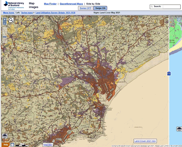
Historic maps provide excellent information on the growth of settlements and urban areas over time. Many British cities expanded during the Industrial Revolution in the 18th and 19th centuries, particularly those towns near to large coalfields (such as Birmingham, Nottingham or Sheffield) or areas of textile manufacturing (such as Bradford, Leeds, or Manchester). (Compare Manchester in 1830 and 1900). Other towns, including major ports such as Bristol, Glasgow, or Liverpool, often expanded as overseas trade increased, with the growth of the British Empire. By the later 19th century, within each urban area, it is also possible to see the different zones and patterns of activity: often there may be an older central core settlement, adjacent and less central industrial areas, sometimes along major transport routes, low-cost housing closer to industrial areas, and higher-cost housing in more peripheral zones. Within the last century, many of these patterns have changed dramatically as industries have closed, commuting has increased, and housing has been both demolished and constructed. (See also Land Use survey mapping, colour-coding urban areas in the 1930s).
Compare British towns in 1900 to 1950 in our Side by side viewer. Each urban area has a distinctive history of expansion and often only partly fits with a standard model - as we see for Edinburgh's expansion over time from 1600 to 1919. The oldest central areas of Edinburgh and Leith are coloured in red. The major 18th century expansion was the 'New Town' to the north (coloured in blue), whilst 19th century expansion was particularly to the south (coloured in brown).
For a town you know, how has its area expanded over time and why? What changing patterns of land-use within the urban area can you spot? Use our drawing and tracing features, or our measurement tools to compare areas and patterns over time. - New Towns
From the 1940s to the 1970s, many New Towns were planned and constructed in Britain, and historical maps are excellent resources for showing these. For example, our Side by side viewer for Welwyn Garden City compares the area in the 1900s with the 1940s. You can also show other layers, including modern map and satellite image layers, to allow other comparisons. How does the layout and structure of these towns look different from other older settlements? How far have the ideals behind these towns been borne out in reality? To what extent to maps reveal some of the advantages and disadvantages of contructing New Towns?
- Tourism
During the 19th century, a growing number of people in Britain were able to go on holiday, encouraged too by an expanding railway network that made it cheap and easy to travel. Many British coastal towns became popular destinations for tourists. Historic maps are extremely useful for showing these developments, both in terms of urban expansion, as well as the growth of facilities for visitors, such as hotels, assembly rooms, ornamental gardens, esplanade facilities, bandstands, and recreational grounds. For example, compare Torquay in the 1870s to the 1900s, or Oban in the 1860s to the 1900s to see the expansion of these new tourist facilities, as well as their growing dominance in the towns. Compare Rothesay in the 1860s to the 1900s where you can see the major investments which had been made during the 1870s, converting four acres of foreshore into ornamental gardens and an esplanade to the west of the harbour, with an octagonal band stand. A new tramway had been laid out, taking visitors along the coast to Port Bannatyne to the north, and a Royal Aquarium was erected between 1875 and 1876 on the site of a former battery at the east end of the town.
Other types of tourism are well illustrated by the Sportsman's and tourist's guide map of Scotland (1897), colour-coding deer forests in green. Before 1811, there were fewer than ten estates in Scotland actively managed for hunting. By 1873, this had grown to 79, and, by 1911, it had risen to 170, covering nearly 3 million acres. The conversion of good grazing land into hunting pleasure grounds often caused considerable resentment amongst local populations.
During the 20th century with the rise of the motor car, many maps of Scotland were created for motoring and touring. (See also Transport section below, and maps showing the development of railways, roads and airports). These changes in types of transport had major consequences for accessibility of particular places, and changed the patterns of tourist locations across Great Britain. What advantages and disadvantages to the growth of tourism over time can you spot on these maps? What economic and social problems might result from tourism? - Transport
- Railways
During the 19th century the growing railway network connected up towns and villages, and allowed goods and people to move quickly and easily around the country. View railway maps of Scotland (1840s-1940s), or of Great Britain (1940s). In the 1960s, many routes were cut by the Government, as road transport increased and the railways were seen as inefficient. Do you think this was a good idea? Part of the Borders Railway reopened in 2015, after closing in 1969. Do you think this should be extended? Or should other historic lines be reopened?
- Bridges
Many important bridges have been built since the Ordnance Survey first edition maps were published in the mid 19th century. These sometimes cross river estuaries (for example, the Forth Bridges or the Humber Bridge), or connect islands (for example, the Skye Bridge). What would the impact have been on the communities in this area? Should other bridges be built across river estuaries or to connect islands?
- Roads
Some roads and tracks can be traced back to Roman times or even earlier, but most roads were built in the last two centuries. To see older road maps, you can view road maps of Scotland (1670s-1790s), as well as maps of Scotland in the 19th and 20th centuries, as most of these show roads. The Ordnance Survey Ten-Mile Planning maps of Great Britain (1930s-1960s) were drawn specifically to show roads and their changes over time. The OS Six-Inch 1888-1913 layer is excellent for showing the detail of roads just over a century ago, whilst the OS 1:10,000/1:10,560, 1940s-1970s layer is best for showing the detail of roads in the mid-20th century. Has the growth of roads been an even development, or have some areas seen far more roads being created? What would the main types of vehicle likely to have been on these roads at these different points in time? What advantages and disadvantages were there to being close to a road?
- Ports and harbours
Until quite recently, most goods and commodities for trade were shipped through ports and harbours. Some of these harbours were also used by fishermen. The expansion (and often, more recent, contraction or re-use) of many ports can be seen over time on historic maps. The OS 25 inch, 1890s-1920s layer is a good starting point for looking at the detail of particular coastal ports a century ago. For ports in Scotland, our Town Plans (1580s-1940s) often provide good detail gowing further back in time before the 19th century. What do you think the main impacts would have been on the local population of the expansion and contraction of port usage over time? Can you find good examples of recent redevelopment of port areas for other purposes? Can modern satellite imagery allow you to understand the main current use of the port?
- Airports
During the 20th century, most of the earliest airstrips in Britain were built for military purposes and were often concealed or censored on Ordnance Survey maps. Civilian airports expanded particularly after the Second World War. Find a large airport today you know, and look at the history of the site. Can you find out what used to be there in the past? What kinds of environmental impact of airports can we discover from the maps? You might find our our Side by Side viewer, comparing the 1930s land-use with present-day land-use useful, as well as the OS One-Inch Seventh Series (1950s-1970s).
- Railways
Physical Geography
- Coasts - erosion and silting
Parts of the east coast of England have experienced significant coastal erosion over time. For example, at Great Cowden, on the east coast of Yorkshire, the coastline has receded by around 200 metres over the last century, so that the entire village has been been swept away. Our Side by side viewer (with swipe) for Great Cowden allows you to see this clearly. Use the Measurement Tools to measure how far the coastline has receded in particular places. Can you find other areas of significant erosion along this coast? What features have disappeared to the sea? How might this understanding help in the management of coastal erosion?
You can also view different attempts at management, engineering and restoration of coastal areas. For example, at Wallasea Island in Essex you can see different attempts at 'soft' and 'hard' engineering over time in several places, enabling salt marsh restoration. Try comparing different dates of historic map layers, as well as air photos (1944-1950)
In other areas, especially larger estuaries and harbours, muds and silts carried down from upstream have often blocked or reduced accessibility to harbours and ports. For example, the Nith estuary in Dumfries and Galloway has silted up over time, so that the original port of Dumfries could no longer be reached by most ships in the 19th century. You can view Admiralty charts of the Nith Estuary from the 1840s to the 1930s, showing the changes in the main river channel, and the new quays at Kingholm and Glencaple, each further away from Dumfries, where ships with a deeper berth could reach. How might historic maps help in the management of ports today, and which areas or channels may suffer from silting?
See also the Dynamic Coast project, which explores which parts of Scotland’s coasts are most vulnerable to coastal erosion (2017 to 2020). Our georeferenced historic maps provided useful baseline maps for tracing shorelines from a century ago, which can be seen in this viewer. - Coasts - spits
Many coasts are in a state of dynamic flux. Longshore drift of sediment along coasts is happening all of the time, whilst sediment brought down from upstream rivers to the sea is often deposited in estuaries at different rates, particularly during unpredictable storm events. Spurn Head, at the mouth of the River Humber, constantly shifts in its position over time due to these different actions. The sea erodes it on the eastern coastal side, whilst the river deposits more sediment on the western estuary side. You can compare Spurn Head in the 1900s to the present day. Use the Measurement Tools to measure how far parts of the Head have moved. Can you find other examples of coastal features which have changed in their extents or position? How might historic maps help with managing dynamic coastal zones, or focusing engineering projects on suitable areas?
- Glaciation
Historic maps, along with modern LiDAR layers, can be very useful for studying the effects of glaciation on the landscape. In upland areas, our 3D viewer is very useful for visualising deeply eroded U-shaped valleys and glacial troughs, arêtes, and features such as corries, glacial tarns and lakes, scree slopes, and ribbon lakes. In many lowland areas, glacial till and periglacial processes have often profoundly affected the landscape too. Modern LiDAR layers can be very useful in highlighting more subtle relief and landforms which are the result of glacial processes.
For example, crag-and-tail glacial landforms north of Bathgate (West Lothian), illustrate glacier movement from from west to east, comparing the OS 1:25,000 1937-61 mapping (left) with the LiDAR DTM layer (right).
Drumlins in Balmaclellan parish (Dumfries and Galloway) are beautifully illustrated both on estate mapping from the 1790s (left) and modern LiDAR layers (right).
Sometimes these areas have changed significantly today (as seen modern maps), and historic maps can show these glacial features more clearly. Sometimes too, the different methods of showing relief on historic maps, such as using hachures (lines showing slope steepness) or layer-colouring (using colour in bands to show heights) can bring out glacial features more clearly. (Compare hachures (left) to layer colours (right) - which of these do you think shows glacial relief better?). - Rivers and flooding
Rivers are constantly on the move, and during flood events, they can change their positions quite dramatically. Their earlier positions and sizes can be clearly seen on historic maps. For example, the braided channels of the River Feshie in Highland Region have changed significantly between each edition of Ordnance Survey mapping. Incised meanders and ox-bow lakes can often be clearly seen on historic maps or LiDAR layers. Sometimes too the earlier positions of rivers are shown by boundary lines, as you can see for the River Dee in our Spy viewer. Here, the parish and county boundary is drawn as a dashed and dotted line, and shows the former river course. Look at a river you know, and see if you can detect how it has changed over time. How can this help to understand and manage it today and how it might change in the future?
- Ecosystems (eg. woodland)
Maps provide a wealth of information about ecosystems and ecological changes over time. For example, using historical maps, woodland can be traced over the last four centuries, even though most detailed information, along with types of tree, are shown best seen with Ordnance Survey maps from the last two centuries. You can easily compare 1920s with present day woodland using our Side by side viewer. (In this Side by Side view, although all woodland was shown in green in the 1920s, the modern Land Cover 2021 layer shows broadleaved woodland in red, and coniferous woodland in brown). Which areas have seen woodland increase in Britain during the 20th century, and which areas have seen a decline? Can we detect the possible reasons for this from the maps? How might understanding former patterns of woodland cover help in managing the planting of woodland today? For more details, view our guide on Maps for researching woodland history.
Map Skills
- Map scales
Scale essentially reflects ratio of a distance on the map to the corresponding distance on the ground. It is often expressed as a representative fraction (eg. 1:2,500), and on historic Ordnance Survey maps it is often expressed too as a ratio (eg. 25 Inch to the Mile). (As there are 63,360 inches in a mile, One-Inch to the mile maps have a representative fraction of 1:63,360. At Six-Inches to the Mile, 63,360 / 6 = 10,560, so the scale is 1:10,560).
At larger or more detailed scales, a map can show far more information, but it usually shows a much smaller geographic area. Different scales of Ordnance Survey mapping from around 1900 are very useful for showing this. You can compare Ordnance Survey mapping for Exeter on the 1:500 plan (left) with the 1:2,500 plan (right). What additional features can be seen at 1:500 which are not visible at 1:2,500? Change the layers on each side to compare other scales of mapping - for example, the OS Six-Inch with the OS One-Inch. What information is lost or generalised at smaller scales? Why might smaller scales of mapping for a place sometimes be more useful? - What's missing?
Maps are never a simple facsimile of the landscape. All maps have to select some things, rather than others, and mapmakers (consciously or otherwise) choose to emphasize some things over others. Often it is useful to consider who made the map, what their main purposes were in making it, and who they made the map for to try to understand the particular selection of features on the map. For example, an estate map, drawn to show the agricultural potential of the landscape for a landowner, usually shows very different features from a military map, drawn for army personnel for planning attack and defence. Compare an estate map with a military map from around 1750 for the same area near Coupar Angus, Perth and Kinross. What features are shown on the estate map which are not on the military map, and why?
It is often useful to ask the question "What is missing from the map?". What has the map-maker excluded that was really there? Sometimes these are called "cartographic silences", and they may reflect bias and prejudice on the part of the mapmaker, a desire to flatter the impression of the landscape and leave out less desirable features, or reflect the censorship of personal or military information.
At different times in Ordnance Survey's history, a significant number of features were deemed to be 'confidential', and were excluded from their maps. These censored features include military installations connected to the army, navy and air force, prisons, gas and other utility works, as well as various industrial facilities. Read about security deletions on the OS 25 inch maps. Can you find military sites which are blank or partially erased on Ordnance Survey maps? Do the military sites appear at all on later maps, or are they always censored? Compare these two maps of Fort George at Ardersier Point, Highland, to get you going! How far is it possible to censor military sites today, given detailed satellite imagery?
3. Types of Mapping Available to view online
An overview of a small selection of maps of particular interest to view on the Map Images website:
Large Scale Ordnance Survey Maps
The Ordnance Survey mapped Britain from the 1800s onwards, and published accurate, comprehensive mapping that provides a wealth of information to researchers. Historic Ordnance Survey maps can reveal the layout of towns and cities, road and rail networks, forestry cover, industrial sites amongst other details. Most areas in England, Scotland and Wales were surveyed in detail between the 1840s and the 1880s, and the Ordnance Survey published revised editions at varying intervals until the 1990s.
- Six-inch to the mile and National Grid 1:10,000 scale mapping provide detailed coverage of the entire country.
- First edition Six-inch mapping, 1840s-1880s: Scotland | England and Wales
- Second and later edition Six-inch mapping, 1890s-1940s: Scotland | England and Wales
- National Grid mapping, 1940s-1970s - Great Britain.
- Larger scale, more detailed, 25 inch to the mile maps, and later 1:2,500 and 1:1,250 National Grid maps are available
for “cultivated areas”, including towns and agricultural farmland with inhabitants. We have:
- 25 inch first edition, 1850s-1880s: Scotland | England and Wales
- 25 inch 2nd edition and later edition maps, 1890s-1940s: Scotland | England and Wales
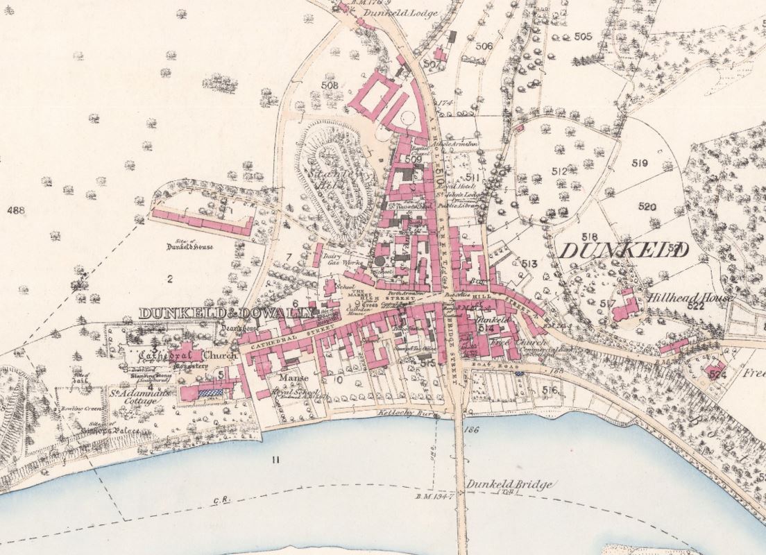
- Very detailed 19th century Ordnance Survey Town Plans provide a wealth of on British cities at scales such as 1:500 or 1:1,056. Scotland (62 towns) | England and Wales (440 towns)
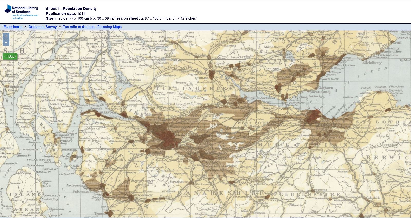
Ordnance Survey 10 mile to the inch Planning Maps
In the 1940s and 1950s the Ordnance Survey used a base map at the scale of Ten miles to the inch (1:633,600) to display an overprint of thematic information. Maps were produced providing information on a wide range of topics, from annual rainfall to population density, iron and steel production to types of farming.
Land Use Survey
The first comprehensive, detailed survey of land use in Great Britain was completed between 1931 and 1938 under the superintendence of L. Dudley Stamp. The recording of land-use was carried out by volunteers, particularly schoolchildren and students, using Ordnance Survey 6-inch to the mile map sheets. Stamp's land utilisation survey focused on land cover rather than functional land use, with six main categories :
- meadow and permanent grass (light green)
- arable land including rotation grass (brown)
- heathland and moorland or rough hill pasture (yellow)
- forests and woodland (dark green)
- gardens (purple)
- land agriculturally unproductive or urban areas (red)
As a result of a collaborative project with Historic Environment Scotland, the 1930s Land Use data for Scotland can be contrasted with Land Use information from 2015 on the Scotland - Land Use Viewer
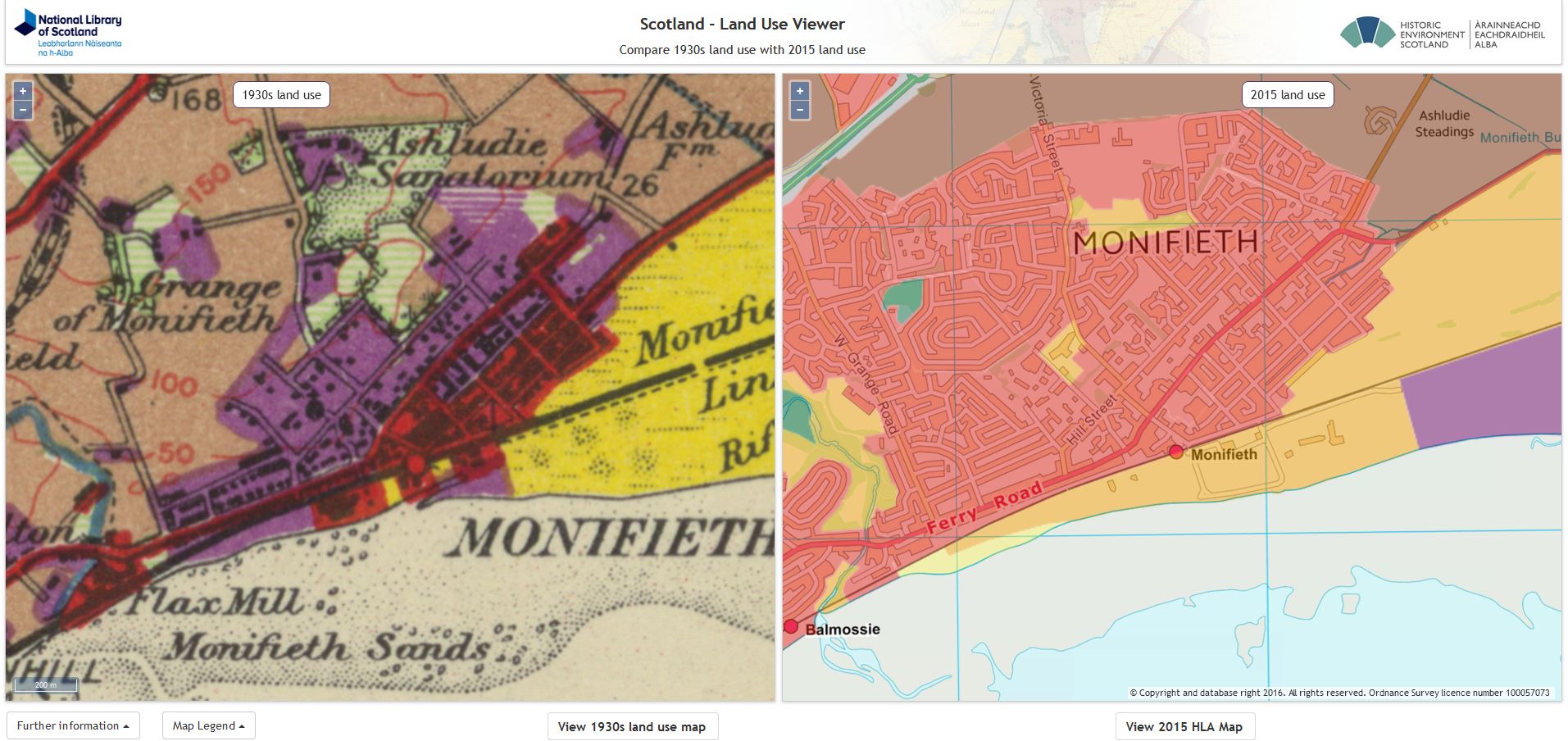
It is also possible to compare the 1930s landscape to a present-day land-use layer for Great Britain in our Side by Side viewer.
Modern LiDAR layers
Light Detection and Ranging (LiDAR) uses a scanning laser to very accurately measure the surface of the ground and its properties. It allows very detailed presentations of relief or terrain, often at spatial resolutions of between 25 cm and 2 metres. LiDAR at 1 metre resolution can be viewed for all of England and Wales, and is available for around 40% of Scotland.
LiDAR has the ability to show the underlying land surface with vegetation removed and to show up patterns of small variations in elevation which are often not visible to the human eye at ground level. LiDAR has many uses, and is particularly valuable for showing subtle variations in relief or elevation on the ground. The following are just a few examples:
- Slopes and small streams are easy to spot, as well as types of trees and their densities.
- Glacial landscape and features, including crag-and-tail features, drumlins, former braided river routes, and glacial moraines.
- Man-made landscape features, including quarries, railway or motorway cuttings and embankments, as well as spoil and landfill heaps.
- Archaeological features including Roman roads, hillforts, sunken ways, cultivation terraces, former field boundaries and march dykes, as well as former settlements such as shielings or lost villages.
View our Using LiDAR layers for landscape research guide for more details.
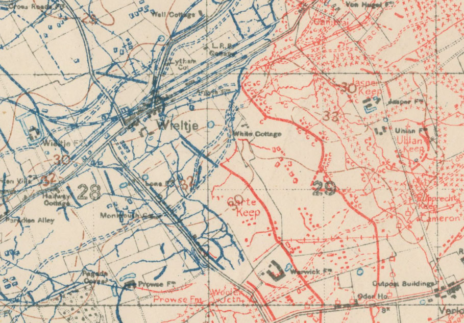
First World War Trench Maps
We also have a collection of British First World War Trench Maps, published 1915-18. These depict both British and German trenches at scales of 1:10,000 or 1:20,000. Trench maps are a primary source for studying the major battlefields of the Great War. They show in detail the changing Front Line and its associated communication trenches, as well as the location of enemy positions and defences including artillery gun emplacements, machine guns, mines, wire entanglements, and observation posts.
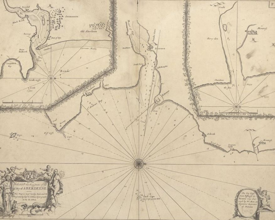
Coastal Charts
The coasts of Scotland can be explored on marine charts dating from the 1580s to the 1900s. During the 19th century, the Hydrographic Office of the Admiralty surveyed all the coasts of Scotland in great detail, often updating charts regularly for busier ports and estuaries.
Historical Maps of Scotland, and of British Counties and Towns
On the Map Images website you can view both maps of Scotland, and of individual county maps and town plans, dating from the 1500s to the 1900s. These are listed chronologically, and provide both an insight into Scottish history, and the development of cartographic styles and techniques. A selection of maps of Scotland on particular themes have been collated.
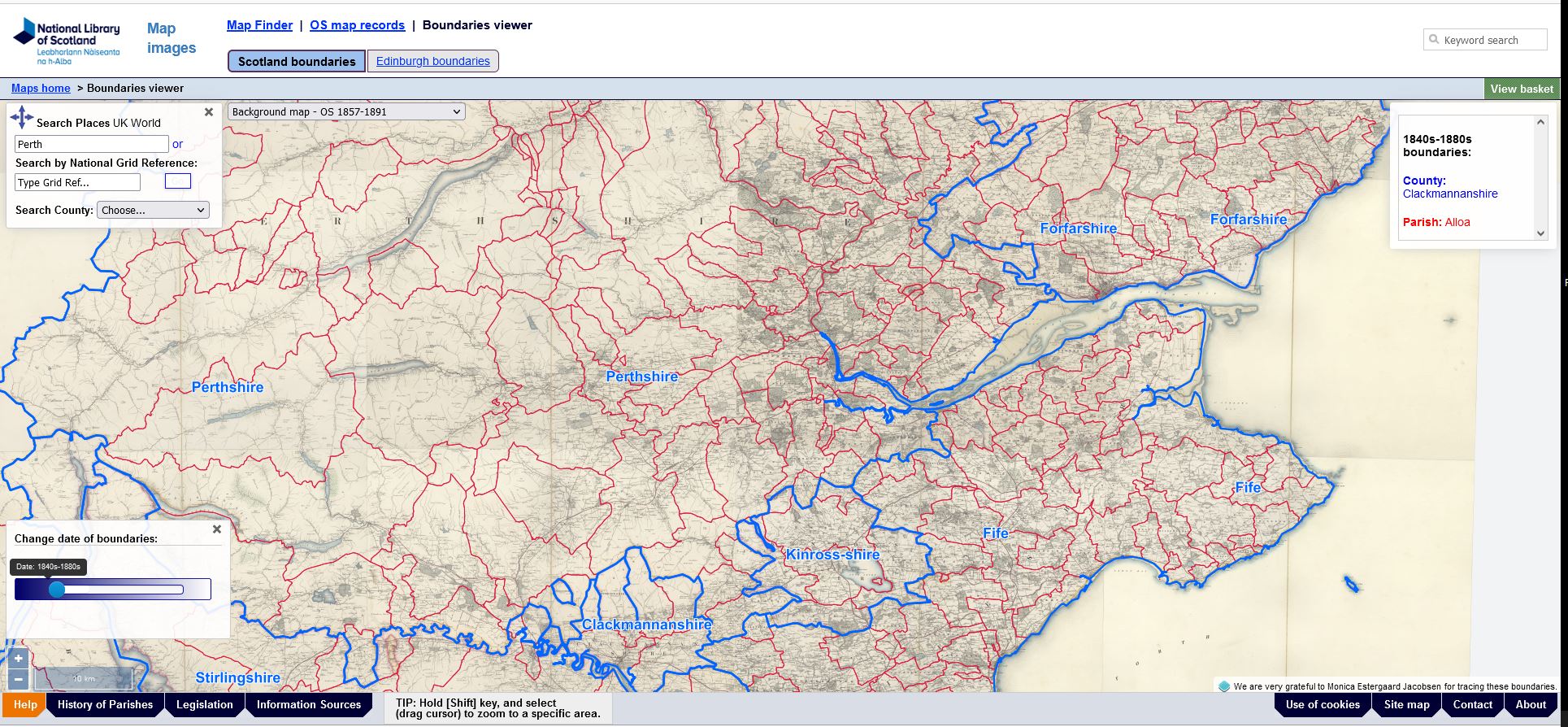
Boundaries Viewer
The Boundaries viewer shows the boundaries of Counties, Parishes and Unitary Authorities in Scotland, England and Wales. As well as showing the areas connected to local government, former parishes and counties are often used in older reference sources and records, but are often not recorded on modern maps. In Scotland, the map shows the boundaries of counties and parishes in Scotland at three points in time. First, as shown on Ordnance Survey 6-inch to the mile maps published from the 1840s to the 1880s. Second, following the Local Government Act of 1947 and before the Local Government Act of 1973 (when these county and parish jurisdictions were formally abolished).
Look at an area of interest and find out which earlier parishes and counties it used to be in. How can this local knowledge of a specific small area help to understand the place?
These are a small selection of the different types of maps available to view on the Map Images website. A full overview of the Map Images Website can be found on our sitemap. As additional maps are digitised, or new viewers or tools are added, these are described in our Recent Additions section.
4. Other resources
You are Here

10 Things you need to know about maps. This concise resource considers some key questions regarding how maps are made, and how we understand them. How far should we trust maps, why are symbols used, is north always at the top of the map, and how is the spherical world flattened for paper or screen? It features interactive quizzes, a glossary of useful map terms, and downloadable learning activities.
Mapping History

Learn more about reading and using historical maps in the Mapping History resource. Use guided case studies to find out about map regression, and how can looking at a sequence of maps over time be useful. A typical map regression workflow can cover:
- What questions do you want to answer?
- What are the limits of your study area?
- What major landscape reference points are there?
- What are the most useful maps which will show you what you need to know?
- How should you record your map regression and gather your results?
Includes guides for looking at symbols, drawing bird's eye and worm's-eye views, activities, PDFs for downloading, and information for teachers.
Researching Climate Change

View ideas on how maps can be useful in researching climate change. View different ways of generating power, less polluting lifestyles and means of travel, fossil fuel extraction and consumption, as well as coastal erosion and sea-level rise. Maps offer a key insight into the history of mankind's interactions with the landscape, including the expansion of urban areas over time, the history of coal and oil shale mining, the growth of petroleum as a fuel, along with pipelines and oil refineries, as well as ways of generating energy through power stations and wind farms.
Digimap for Schools Learning Resources

Digimap for Schools includes modern and historical maps, as well as modern aerial photography for viewing and printing. There are also clear and intuitive measurement and drawing tools for plotting routes or annotating and customising maps. You can also add your own data onto the maps, add overlays, markers and other features. There are also a set of Learning Resources, some of which are directly focused on historical maps and themes. These include guides for teachers, slides, and links to topics in the curriculum.
NLS provides the historical maps in Digimap for Schools, which include Ordnance Survey one-inch to the mile mapping from two dates: around 1900 and around 1950. On the NLS Map Images website, there are far more historical maps at larger scales, but Digimap for Schools has much better modern mapping and air photography, a much easier interface for creating and printing maps, and excellent detailed Learning Resources.
Support for Schools
Talks and Workshops
We can provide online or in person workshops for groups to explore the Map Images website, or our Map Collections. We can also organise Virtual Reading Room sessions, using a visualiser to view items. These group sessions can either provide a general introduction, or could be tailored to a particular topic of interest. Please email maps@nls.uk to if you would be interested in arranging a session for your class.
Copies of Maps
We can supply high resolution images, colour prints or black and white photocopies of the maps on our website. Read further information on copies and How to Order Copies. Please contact us if you would like any assistance in ordering copies.
Re-using content
You are welcome to use any of the images and text on this page. Most of our online maps are re-usable under CC-BY terms - for specific details, please see our Re-use of images on this website information.
Acknowledgements
We are very grateful to Brendan Conway of Notre Dame School in Surrey, for very helpful advice and assistance on earlier drafts of this page.
We hope you have found some of this information new and useful. If you have further suggestions or comments, please do contact us at maps@nls.uk.
View our other Research guides.