Researching climate change with our maps website
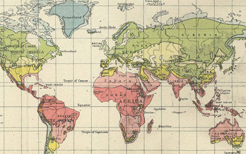
The Library’s online map collections can be used to illustrate and understand climate change in a wide variety of ways. Maps provide many insights into historic landscapes and environments, showing different ways of generating power, less polluting lifestyles and means of travel, fossil fuel extraction and consumption, as well as coastal erosion and sea-level rise. Once georeferenced, so that historic maps can be overlaid on their present-day location, comparison of change over time can be very revealing. Here we pick out a few examples of subjects illustrating climate change which maps can reveal:
Coastal erosion and sea level rise
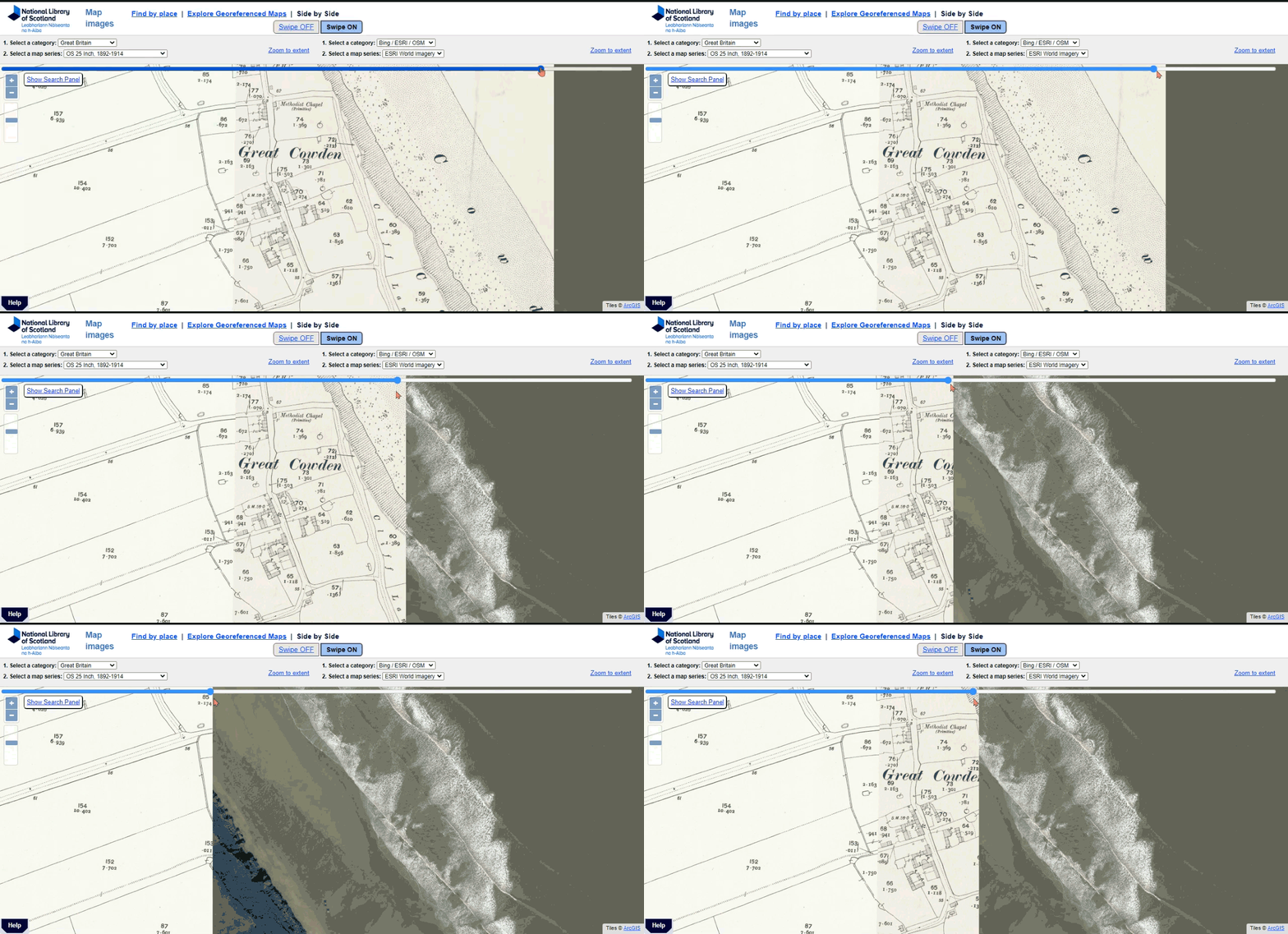
day shoreline in our Side by side viewer (with swipe)
Our georeferenced map viewers provide a useful tool for directly seeing the shocking effects of coastal erosion along parts of the British coastline. For example, at Great Cowden, on the east coast of Yorkshire, the coastline has receded around 200 metres over the last century, so that the entire village has been been swept away.
Global warming causes sea-levels to rise as oceans expand, and storm patterns increase in severity. Most of the world’s coastlines will be affected to some extent through inundation and increased erosion.
Dynamic Coast project
The Library has actively contributed to the Dynamic Coast project, a pan-government project which explores which parts of Scotland’s coasts are most vulnerable to coastal erosion (2017 to 2020). Our georeferenced historic maps provided useful baseline maps for tracing shorelines from a century ago. Although climate change is only one of the factors in past shoreline change, it will certainly be ever more important in the future.
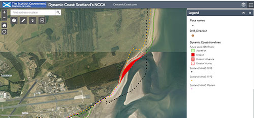
The dashed black line shows the high-water mark a century ago.
Parts of this beach just north of the Eden Estuary in Fife have suffered the fastest rate of erosion in Scotland, with some stretches of coast moving inland some 500 metres in less than 100 years. It is estimated that the tides here will have moved inland another 100 metres by 2050.
Around 2,300 miles of Scotland's "soft coastline" is at risk of erosion. This is particularly true of land reclaimed from the sea and the large extents of this illustrated well in a map showing reclaimed land in the Forth Estuary (ca. 1909).
Water scarcity in India
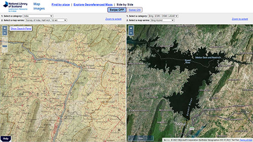
present, showing the effects of the Mettur Dam, constructed from 1934.
As our map collection is an international one, our historic maps can be used to illustrate human-induced environmental change around the world too. We are currently scanning and georeferencing historical maps of India to support a research project in water resources in the Coimbatore environs and Kaveri River Basin in southern India. The frequent droughts in the past four decades in the Coimbatore region due to climate change, has resulted in many waterscapes being converted into concrete, and many water bodies are now nearly extinct. We can use the georeferenced historical maps to identify these man-made environmental changes. For example, the Kaveri River before and after the construction of the Mettur Dam, which began in 1934, depicts the significant effects of dam construction on hydrology. Many previous perennial reservoirs or water tanks are now dry, but their locations (shown by blue dots on the half-inch to the mile historical maps) can be well revealed through georeferencing. The maps are helpful in locating the hydraulic transformation over the past 150 years in and around the Erode, Karur, Tirupur and Coimbatore districts of Southern India.
Alternative ways of generating power - water mills
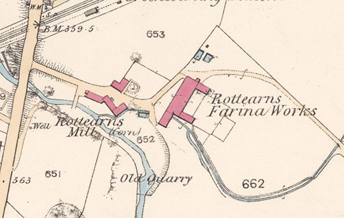
Mill, Strath Allan, Perthshire, in 1863.
Did you know that in 1900 there were over 14,000 mills in Scotland, the vast majority of which were water-powered? Water power was free, easy to harness, generally quite reliable and had no carbon emissions, yet many of these mills transitioned to use fossil fuels by the late 20th century. It has been argued traditionally that the reasons for this transition could relate to water scarcity and the falling costs of coal over time, but more recent arguments have looked at the social and economic advantages of steam power within capitalist accumulation and production processes. Understanding the causes of the steam age and global warming is of key importance for realising the successful transition to renewable energy sources.
These themes are central to the Water to Steam research project, which is currently examining the detailed distribution of these mills across Scotland over time. Our historic Ordnance Survey maps an excellent source for showing both the detail of these water mills, and their wider distribution. View our Scottish water mills website, showing distributions of mills in Scotland.
Coal mining maps and plans
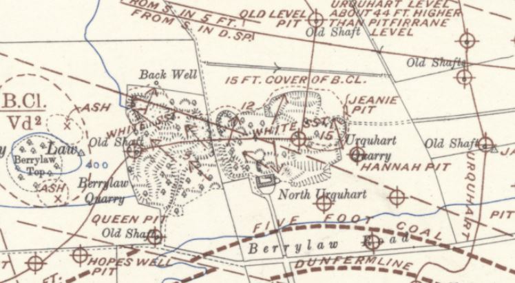
The coal industry is a significant emitter of greenhouse gases contributing 46% of global carbon emissions. The Map Collections have a wealth of information about coal mining, from site specific plans of mines, to coal related maps of wider areas, including counties or the whole of Great Britain. Several site-specific plans can be found in Estate Maps of Scotland, 1730s-1950s section (for example, this plan showing Bo’ness bores in 1880). Another example of a site-specific coal mining plan shows Blind Coal workings at Whiney Hill, near Dunfermline (1783). This can be compared to later geological maps by the Geological Survey of Scotland showing coal mines, old shafts, and underground coal seams:
Coal mining was also important in Lanarkshire. In 1871, there were 22,663 coal miners in Lanarkshire. In fact, 63% of all miners in Scotland lived in Lanarkshire. This map below shows coal and ironstone mines as circular symbols, with existing and proposed railways as continuous and dashed lines, respectively.
![Extract from Map of Central Lanarkshire, showing coal and ironstone mines, lease holders to mineral rights and existing and proposed railways including mineral lines focusing on the Coatbridge area [circa 1872] Extract from Map of Central Lanarkshire, showing coal and ironstone mines, lease holders to mineral rights and existing and proposed railways including mineral lines focusing on the Coatbridge area [circa 1872]](img/coal-mining-coatbridge.jpg)
focusing on the Coatbridge area [circa 1872]
There are also maps that show the concentration of the coal industry in Scotland like Bartholomew’s Economic Map of Central Scotland, published in 1912.
Airport expansion over time
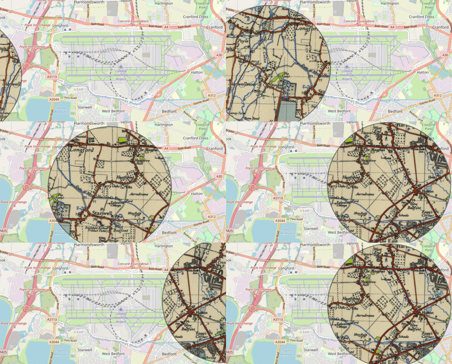
Recent studies have calculated that airports have contributed 32.6 tonnes of CO2 emissions since 1940. The Map Collections can be used to research airport expansion and indirectly the impact of aviation on climate change. For example, the Spyglass viewer shows the growth of Heathrow airport from a small private airport into a major international airport.
Heathrow Airport handled over 80 million passengers in 2019. It is very different from its modest beginnings as a small private aerodrome, initially called Great West Aerodrome, in the 1920s. During the Second World War, the Air Ministry commandeered the airport and built an RAF base. After the end of the war, Heathrow became a civil airport. With the rise of package holiday during the 1960s and 1970s, Heathrow grew into a much larger airport, but still smaller than today. These changes can be compared through our Side by side viewer (with swipe).
Oil shale extraction and waste
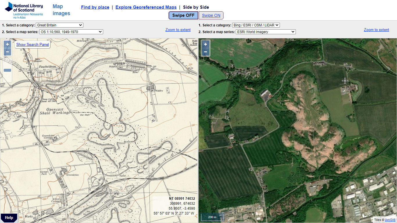
north of Broxburn from the 1950s to its present-day extents.
The oil shale industry, centered on West Lothian, grew fast from its origins in the 1860s. At its height in about 1912, over 12,000 people were employed, and output accounted for about 2% of the world's oil production. Oil shale works, of course, had significant damaging environmental impacts, on the air, water supply and surrounding landscape. An 1872 Royal Commission examining pollution described how the quantity of discharged oil from the works floating on top of the River Almond was so large it could be ignited, and “often blazed up about 20 feet high”. Meanwhile extracted shale and other residues from the works built up to form the huge artificial bings which show up clearly on maps and on the ground today.
In 1919 a pipeline was laid to carry imported crude oil from Grangemouth docks to Uphall shale oil works, which was used to test refining imported oils. This experience was then applied to the design of Grangemouth refinery, opened in 1924.
Growth of Grangemouth Oil Refinery
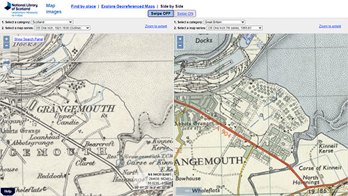
the Side-by-side viewer.
Oil refining contributes to 4% of the UK’s greenhouse gas emissions and 6% of global emissions. In 2012, UK refineries emitted 16.3 million tonnes of CO2 and a sizable amount of methane too.
Maps can also be used to study the development and growth of oil refineries. For instance, Grangemouth Oil Refinery opened in 1924 and grew over the next 20 years to meet the demands for fuels and petrochemicals.
Initially Grangemouth was a small simple refinery that processed oil collected from the Persian Gulf. (View Grangemouth in 1943). Typically, 360,000 tonnes of oil was refined annually prior to the Second World War. After the war, the refinery expanded to include a BP research facility and increased processing to 9 million tonnes of oil. After the discovery of North Sea oil in the 1970s –Grangemouth refinery was added to the Forties pipeline network (built to transport offshore oil to onshore sites) and the expansion of the site can be seen in this Side-by-side viewer.
Transport and road developments over time
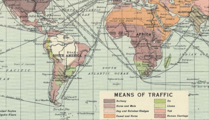
South America and Africa.
Only a century ago, the main ways of getting around were vastly different to today, with the railway the predominant means of transport across the world's richest countries in Europe, North America, and Oceania. The camel and horse predominated over large parts of northern Africa, central Asia, and Australia, with mules and horses across most of Canada, Siberia, and China. The ox prevailed in parts of South America, Southern Africa, India, and present-day Indonesia, with dog and reindeer sledges in Canada and northern Siberia. Bartholomew’s Means of Traffic map (1920) shows the different ways people travelled all over the world.
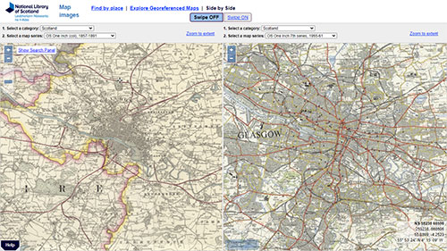
the 1960s using the Side-by-side viewer
Transport contributes around a third of all CO2 emissions in the United Kingdom. Most carbon emissions derive from road transport and particularly car transport. Prior to 1914, most cars were owned by the affluent and consequently there was little need for a large road network (as shown in this 1910 map). After the First World War, the Ministry of Transport provided funds for road building to reduce unemployment. More citizens became car owners (from 110,000 people in 1919 to 1,056,214 in 1930). The government became aware of the poorly maintained road infrastructure and by 1935, 500 miles of roads were built in the United Kingdom. These two maps from 1926 and 1937 illustrate road expansion in Scotland (Road map of Scotland (1926) and Road map of Scotland (1937)).
Cars became even more popular in the 1950s and 1960s. The first motorway was opened in 1956 (Preston Bypass) and the 1960s saw a boom in motorway building. This Side-by-side viewer shows the changes between roads in 1940s and roads in 1950s across Great Britain.
Case studies of three power stations
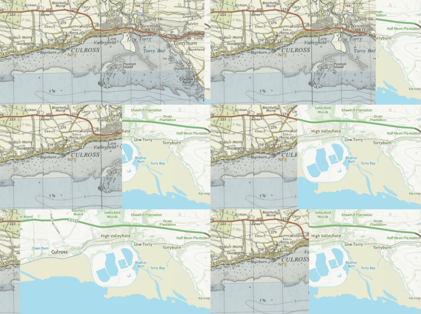
station's operating life, showing changes to the shore
Global CO2 levels reached over 400 parts per million in 2015. Coal is considered one of the worst polluters of the three fossil fuel industries (coal, gas and oil ), and the effects of this can be seen locally in many specific power stations. For instance, Longannet Coal-Fired Power Station, between Kincardine and Culross was opened in 1970 and closed in 2016. In 2003, it was named as Scotland's biggest polluter in a report by the Scottish Environment Protection Agency (SEPA), and in 2007, the World Wildlife Fund for Nature (WWF) named Longannet as the most polluting in the UK, looking at CO2 emissions compared to power output. The station produced up to 4,350 tonnes of ash per day, which was piped to ash lagoons on reclaimed land to the east. This effectively erased the former Preston Island.
Another example of a power station that can be looked at through our Map Images website is Pinkston. This power station was a coal fired power station built in 1901 to power Glasgow's tramways. The initial building can be viewed on this Ordnance Survey 25 inch to the mile map showing Pinkston Power Station, revised in 1909. The power station was demolished in 1978.
Dewar Place station powered Edinburgh trams from 1897; later the site was developed throughout the 20th century. This Side-by-side viewer shows the earlier layout of the station from 1926 and the site today.
Polar ice changes
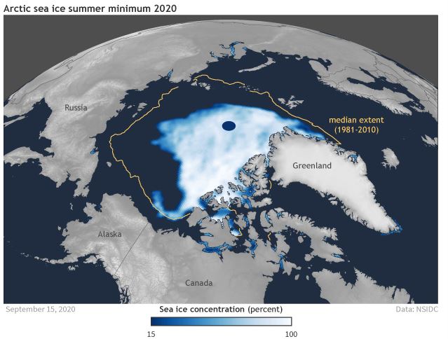
to the much larger median extent (1981-2010); shown in orange.
Image courtesy of NOAA Climate.gov
Satellite modelling of the polar ice caps from the 1950s have shown significant decreases in the extent of ice cover. The September minimum ice extent trend for 1979 to 2011 declined by 12% per decade over 32 years, and in 2007 the minimum extent fell by more than a million square kilometers, the biggest decline since accurate satellite data has been available. Historic maps from the Times Survey Atlas of the World (1920), show the outer limits of pack ice around the Arctic (View North Polar Regions map ). Even allowing for annual fluctuations and limited data, these are much more extensive than the extents shown by satellite imagery 50 years later, and the rates of annual decline are accelerating.
The Intergovernmental Panel on Climate Change (IPCC); reported in 2020 that the polar ice caps are melting six times faster than in the 1990s, according to the most complete analysis to date. Without rapid cuts to carbon emissions the analysis indicates there could be a rise in sea levels that would leave 400 million people exposed to coastal flooding each year by the end of the century.
Land Use and Urbanization
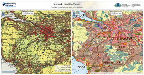
1930s and 2015.
Urban areas are a major source of man-made climate change through transport, heating, cooling and other processes. Some studies suggest more than 90% of CO2 emissions are from urban areas. Urbanization increased in the last century; in 1940 only 12% of the world population lived in urban areas but by 1980 this rose to 33%. Land use maps are useful for tracking the growth of residential areas. The Scotland - Land Use Viewer shows the striking growth of urban land (shown in brown) in Lanarkshire and Ayrshire in the second half of the 20th century.
The Scotland Land Use Viewer is a partnership with Historical Environment Scotland that allows users to compare the 1930s Land Utilization Survey with the 2015 Land Use Survey.
We hope you have found some of this information new and useful. If you have further suggestions or comments, please do contact us at maps@nls.uk.
View our other Research guides.
