This page was originally published as a blog post. It is intended to follow on from Geocoding the Stevenson Maps and Plans of Scotland to create an overall account of the progress of this project.
This page is divided into the following sections:
- Introduction
- OpenLayers code and supporting information
- Using GeoJSON for the Stevenson data
- Adding subject and date filters
- Displaying record details on mouse hover and click events
- Filtering records by map zoom level
- Other additions to the map interface
- Text Search Page
- Evaluation
- Response to feedback
Introduction
This page follows on from the work of Geocoding the Stevenson maps and plans of Scotland. This process generated a file that linked metadata describing over 2000 maps and plans to the specific locations in Scotland that they covered. Once we had created this file, the next task was to make the data available online in an easily searchable way.
There were three main aims in creating the map interface:
- To allow the Stevenson maps covering a particular place to be quickly discovered by clicking on the place.
- To allow easy filtering of the maps by subject and date.
- To allow the different geographic extents of the maps to be clearly visible.
We also were keen to keep the interface as simple and clear as possible.
OpenLayers code and supporting information
The Library already has extensive experience of OpenLayers, allowing a number of components and map layers to be re-used from elsewhere. (For further details of these, see the blog Using the Library’s open-source map viewers and the more detailed paper: C.Fleet, A web-mapping toolkit for Libraries, e-Perimetron 14(2) (2019), 59-76). We started from the Library’s GeoCart’2018 resource, which is available on the maps website. This was created for a workshop on Putting Historical Maps Online, and provides a set of basic OpenLayers viewers with guidance notes, which gave us a basic framework to use as a starting point. We could then use the GeoCart resource to rework and customise the viewers based on the specifics of the Stevenson project, rather than starting from scratch. This initial viewer we used was FindbyPlaceGEOJSON. This shows boundaries of map series as GeoJSON files, and uses the OpenLayers map.forEachFeatureAtPixel method to select sheets, based on mouse hover over features.
Using GeoJSON for the Stevenson data
We developed the initial basic viewer using incomplete test data for points, as a proof of concept - effectively just substituting the map sheets GeoJSON for Stevenson GeoJSON for point records. For the majority of the work, however, it was important to make sure we had as complete data as possible since the viewer would be filtering and displaying the data in various ways. We therefore uploaded the completed Stevenson data to the web interface as a GeoJSON file, which is a format that QGIS is able to export to. GeoJSON was an ideal format for our data. It is open-source, viewable with any text editor and in geojson.io, easily read and displayed by all web-mapping systems, including OpenLayers, and able to hold regular, structured data. As the whole set of our Stevenson GeoJSON was only 1.8 MB - only about 2000 maps in comparison to over 200,000 on the main maps website - it could be processed in the web-mapping client browser, allowing much better immediate interaction with the content than if it had been held on a web server.
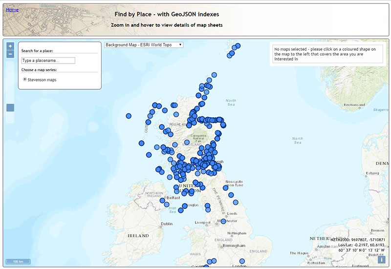
We were keen to explain below the way we adapted the initial Javascript to incorporate the additional functionality we needed, in case any of these functions and work are of value for others. The whole Javascript code for the application is in one Javascript file which can also be viewed and downloaded from Github. This file has been commented so that all the functions are briefly explained before them - we describe the main ones below.
Adding subject and date filters
To make the resource more useful, we decided to make it filterable in several ways. The first filter we added was for subject. We had added controlled subjects to the data during the geocoding, so it was relatively easy to generate a drop down list that corresponded with this field. We used the standard jQuery.grep() command for this, so that the features would be filtered from one layer to another by subject. Users could then choose to view only plans relating to a certain type of project depending on their interests.
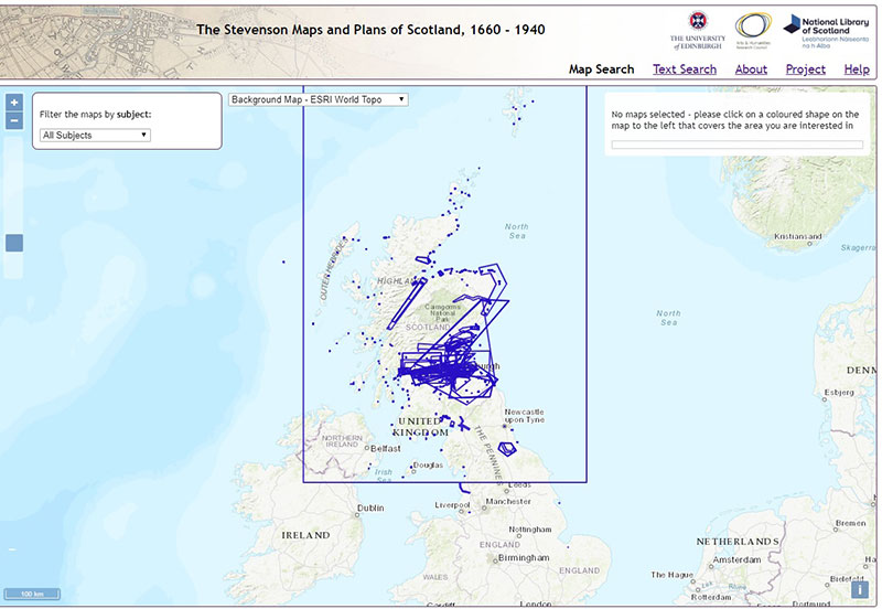
It got more complicated when we added an ability to search by date. The implementation of a date range slider was quite straightforward, using the jQuery slider range code, but we needed to add additional options too. Many of the maps and plans in the collection are undated, or cover a span of multiple years – some were initially drawn in one year but were added to, annotated or amended at a later date. We decided to deal with this by giving all of the records a date span rather than a single date. This means that they are visible if the date slider covers any part of their date span. We initially gave the undated plans a span that covered the whole range of the collection so that they would be visible under any date range. However, when we tested this, we found that it was almost impossible to get an idea of change over time using the date filtering function because there were so many undated plans that remained visible under any filter. We didn’t want to omit the undated material completely, so we decided to add a checkbox enabling users to include or exclude it from their searches. We felt that this made it much easier to analyse changes in the business over time.
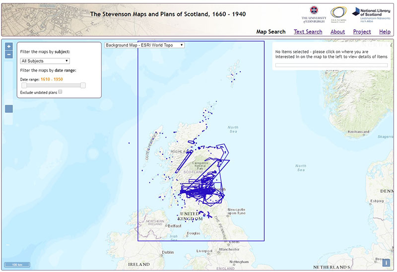
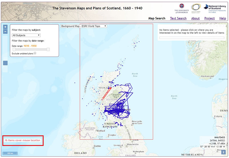
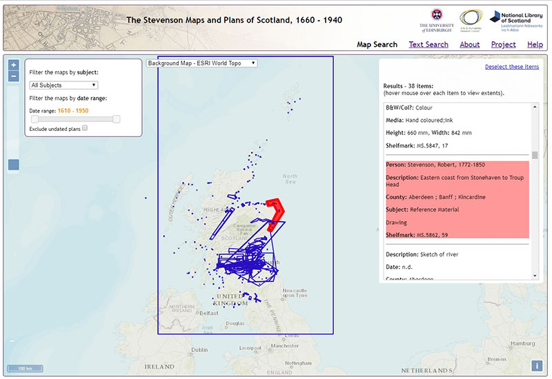
We then added a display on mouse hover that showed the number of plans that covered each point on the map. We implemented this by adding a listener function to the mouse pointermove event, unselecting previously selected features and initiating a map.forEachFeatureAtPixel function. This was important as many of the geocoded bounding boxes overlapped exactly with one another, particularly when the Stevensons drew multiple plans for the same project, or went back later to make alterations or repairs.
Displaying record details on mouse hover and click events
On a standard mouse singleclick event, the interface displays a list of all of the plans covering the selection location. This used the map.forEachFeatureAtPixel method, with the selected records from the Stevenson GeoJSON passed into a right-hand Results div element. We also implemented a function using jQuery, so if the mouse was hovered over the Results div records, it would look up the record id, find this feature in the map layer, retrieve its extents, and then centre the map on the feature and highlight it.
Filtering records by map zoom level
Once we had implemented this way of searching the material, we discovered another problem. While the system worked well for selecting plans that covered large areas of Scotland, when the user zoomed in and selected a very small box, for example a box covering one village, the application brought back everything covering that point – including a map of the whole of Scotland! We thought that users who had selected a very small area would find this unhelpful and distracting, so we had to rework the interface to come up with a solution.
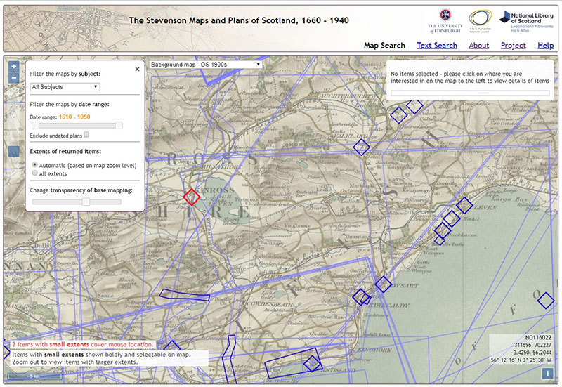
We did this by separating the boxes into three layers based on size. We assigned a new field to our GeoJSON data, dividing the data into shapes with SMALL, MEDIUM, or LARGE extents, using the QGIS $area expression. We then set up another filter on the Stevenson GeoJSON depending on the zoom level, splitting up the data so that at each of three zoom levels, one of the categories would be shown in bold and selectable, whilst the other two categories appeared partly transparent, and unselectable. Now, the default setting of the viewer is that all material is shown but only material that is appropriately sized based on the level of zoom is selectable. This means that if someone is interested in one town or village, they can zoom in and select that place and only maps and plans of that place are returned, whereas if they are interested in plans covering a wider area, they can select these while zoomed out. We added a checkbox to turn off this automatic filtering so that the interface would return everything covering a specific point regardless of scale. Users can choose how to navigate the material based on the specific query that they are investigating. At this stage we also changed the default background mapping to the NLS Ordnance Survey 1900s map layer, which we felt was more appropriate for the Stevenson material, implementing too a jQuery slider to allow the user to fade this, as necessary, in order to either view the overlaid polygons more clearly, or view the background mapping more clearly.
Other additions to the map interface
With the main functionality in place, we also added a few additional features:
- a Permalink URL. Adding a Permalink suffix onto the end of the URL can be useful for defining the ol.View (with a specific zoom, lat, and lon), as well as a specific point clicked on. We did this through an
updateUrl()function that creates thewindow.location.hashpart of the URL with the current zoom=, &lat= and &lon= elements through an event listener on the mapmoveend event. Second, the elements of the URL define the map view through initially being parsed on the ampersand character, and then specified as zoom, lat and lon variables, which are then integrated into the main map parameters. Default zoom, lat and lon parameters are defined for the initial page load if the URL suffix is not specified. - a customised mouseposition. This was taken from our other web-mapping applications, enhancing the standard lat/lon location with British National Grid coordinates too, to the lower right of the screen
- a defined maximum extent for the viewer, centred on Scotland, and a minimum zoom, so people couldn’t whizz off to another part of the world, or zoom to outer space.
The final map application had a base layer and four GeoJSON layers on top, so that the various filter processes extracted and added features between layers:
- GeoJSON4 - the red selected features
- GeoJSON3 - the dark blue selectable features
- GeoJSON2 - the pale blue unselectable features
- GeoJSON1 - the initial whole set of GeoJSON data
- Base mapping - OS 1900s
Text Search page
Once we had finished the map-based selection methods, we added a text search page. First, our spreadsheet of Stevenson records was loaded into the Library’s SQLServer database, and standard SQL based query syntax was used to query the content.
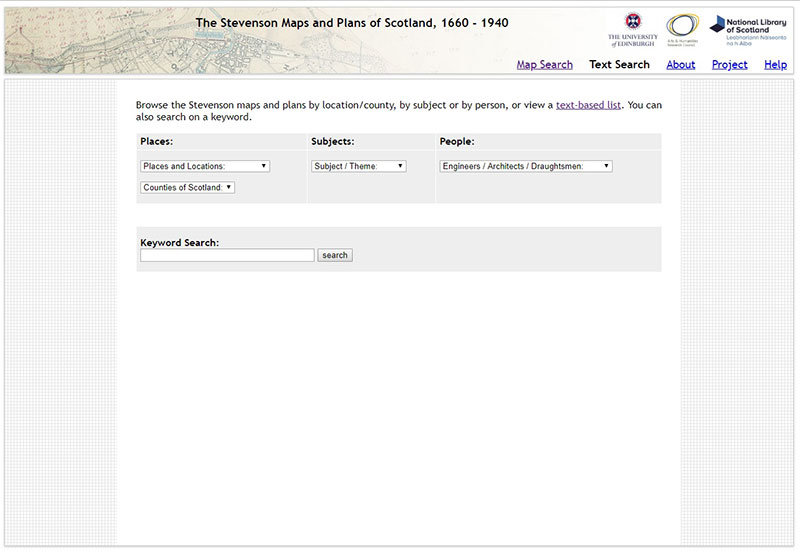
This text browse page functions more like a conventional library catalogue, enabling users to search by subject, place, person and keyword and returning a list of records containing that reference. Again, we wanted to give users the power to tailor how they navigate the material based on their specific inquiry. Keyword searching in particular allows users to search based on the item description which includes more detailed summary of what the plans show, or to search any of other aspect of the data, such as shelfmark. The drop-down menus for subject and place are very similar to the map-based navigation, although the option to search for maps or plans of places by name might be more useful than the map interface for those less familiar with Scottish geography.
We decided that we would not include filtering by person in the map interface because there were a huge number of people represented in the collection but the number of maps and plans by each person was usually very small. Often there were only one or two maps by a particular individual. Many of the maps and plans are uncredited. As might be expected, the Stevenson family were the exception to this. Robert, Alan, David, Thomas, David A. and Charles are all credited with over 100 plans each. In fact, there over 400 maps in the collection are attributed to David Stevenson, specifically, either alone or in collaboration. The combination of the number of people represented and the relative lack of plans per person outside of the Stevenson family would have increased the complexity if included in the map-based search but would be unlikely to generate particularly useful insights. We hope that by including this information in the text-based search as a drop down menu, users who are interested in specific individuals will be able to find the information they want even though this option is not available in the map-based search interface.
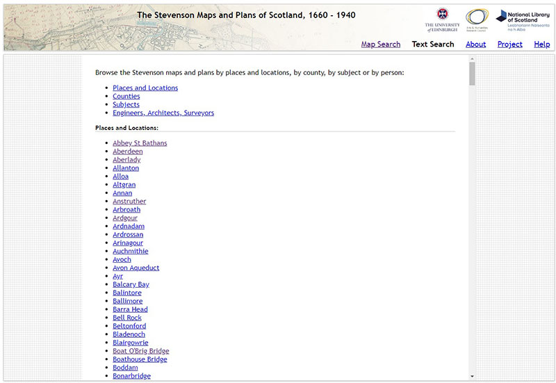
Once we had created a text-based search as a drop-down menu, we displayed all of the options in the form of a full list. This format can be found by search engines and also may be preferred by readers using smaller devices or screen readers.
Evaluation
Whilst we felt that the resulting viewer had generally achieved the three main aims we set ourselves, we did consider the results were necessarily something of a compromise. The relative complexity of the Stevenson material, with content at very varied scales and extents, as well as with concentrations (for example, around Edinburgh), meant that the interface was more complex than we would have wished. We felt that points or markers reflecting the locations would have been much simpler and clearer to present online, but would have been far less helpful to the user in giving details of the real extents on the ground of features. A marker pin approach (for example, the Library’s Map Finder- with Marker application ) would also have been much clearer to see online, but frustrating, as the user would not have been given any clues as to where to locate the marker for best results. Splitting up the Stevenson material into different geographic extents, as the Library does for its Admiralty charts would also have added complexity, forcing the user to select different layers to view everything.
We also considered the value of trying to colour-code the material, for example by subject, but felt that the range of subjects and the number of overlapping features would not have created an attractive or helpful result. The aim with our colour-coding has been to use shades of blue for outlines of features, and red for selected features, which is fairly simple and intuitive.
Response to feedback
Once the website had been created, we did some user testing with the map library staff to ensure that the website was as intuitively navigable and user-friendly as possible. Following a practical demo of the interfaces and discussion, the map staff made several useful suggestions that we were able to implement:
- Map search - rewording of search panel terms. We revised the use of the terms "plan" and "map", so that "plan" referred to the Stevenson plan records, and "map" referred to the base mapping. One of the reasons for this was so that the filter functions and the "Exclude undated plans" options clearly referred to the Stevenson plans, whilst the "Change transparency of base mapping" clearly referred to the underlying base map. We also altered the wording of the map extents filter from "Extents of returned items" to "Filter plans by coverage?", to make it consistent with the other Filter options, and clearer what the choices here would do.
- Map search - adding a gazetteer search option. We already use the OSMNames gazetteer in our other web-mapping applications, which allows fast querying of the OpenStreetMap gazetteer with place name autocompletion, and this was added to our left-hand search panel.
- Text search - providing clear guidance on extent of indexing. As the Stevenson metadata was inconsistent, we added clearer guidance under each search facet (ie. location / county / subject / person ) as to how many records were indexed and searchable under these terms. We had assigned subject terms and counties comprehensively to all records, but only some records had named people associated with them, or a defined location, so we made these differences clearer. We also reworded the "Places" facet to "Towns / Villages / Names Locations", which was felt to be clearer.
- Text search - View specific map link from the text search results. A final suggestion was to add a direct link from each text search record, to view the extents and location of the particular plan relating to that record in the map search interface. The map search viewer URL was adapted to accept a
#id=xxURL suffix, which initiated the functionzoomtoID. This looks up the geometry of the feature with the relevant ID in the Stevenson GeoJSON, highlights it and zooms to it, whilst also displaying the particular record in the results panel. This function exploits the potential of having geographic extents for each plan, and a way of drawing together the map and text search interfaces, so that users can move more easily between them.
View the Map Search and Text Search interfaces, or download the Map Search interface from Github.

